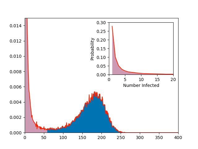
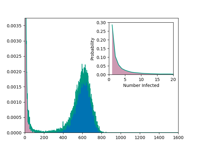
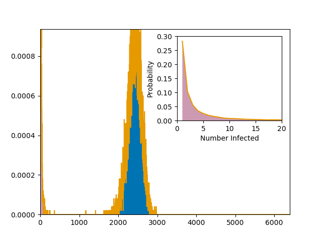
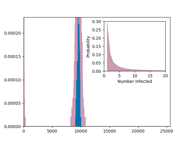
Figure 6.1 (a, b, and c) and 6.3 (a, b, c, d, and e)
This code does both 6.1 and 6.3 since they use the same data. It produces an additional figure not included in the text for 6.3.
6.1
6.3
import networkx as nx
import EoN
from collections import defaultdict
import matplotlib.pyplot as plt
import scipy
colors = ['#5AB3E6','#FF2000','#009A80','#E69A00', '#CD9AB3', '#0073B3','#F0E442']
def getMs(counts):
r'''used for figure 6.3 to get the values of M1, Mstar, and M2'''
N=len(counts)
M1 = 0
val1 = 0
M2 = 0
val2=0
Mstar = 0
valstar = 1
for index, val in enumerate(counts):
if index<2:
continue
if val < valstar:
Mstar = index
valstar = val
elif index - Mstar > 0.1*N:
break
for index, val in enumerate(counts):
if index>Mstar:
break
elif val>val1:
val1=val
M1 = index
for index, val in enumerate(counts):
if index < Mstar:
continue
elif val > val2:
val2 = val
M2 = index
return M1, Mstar, M2
iterations = 5*10**4
p=0.25
kave = 5.
labels=['a', 'b', 'c', 'd', 'e']
for N, color, label in zip([100, 400, 1600, 6400, 25600], colors, labels):
print(N)
xm = {m:0 for m in range(1,N+1)}
G = nx.fast_gnp_random_graph(N, kave/(N-1.))
for counter in range(iterations):
t, S, I, R = EoN.basic_discrete_SIR_epidemic(G, p)
xm[R[-1]] += 1./iterations
items = sorted(xm.items())
m, freq = zip(*items)
plt.figure(1)
plt.loglog(m, freq, color = color)
plt.figure(2)
plt.plot(m, freq, color=color)
plt.yscale('log')
freq = scipy.array(freq)
m= scipy.array(m)
plt.figure(3)
plt.plot(m/float(N), N*freq, color = color) #float is required in case python 2.X
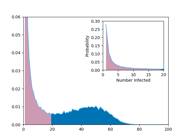
M1, Mstar, M2 = getMs(freq)
plt.figure(4)
plt.clf()
plt.axis(xmin = 0,xmax = N, ymax=6./(N), ymin = 0)
plt.plot(m, freq, color= color)
plt.fill_between(range(1,Mstar+2), 0, freq[0:Mstar+1], linewidth=0, color = colors[4])
plt.fill_between(range(Mstar+1,len(freq)+1), 0, freq[Mstar:], linewidth=0, color = colors[5])
inset = plt.axes([0.55,0.5,0.325,0.35])
inset.plot(m, freq, color= color)
inset.fill_between(range(1,Mstar+2), 0, freq[0:Mstar+1], linewidth=0, color = colors[4])
inset.fill_between(range(Mstar+1,len(freq)), 0, freq[Mstar+1:], linewidth=0, color = colors[5])
inset.axis(xmin=0., xmax=20, ymin=0, ymax = 0.3)#, ymin=-counts[0]*iterations/100)
inset.set_xticks([0,5,10,15,20])
plt.xlabel('Number Infected')
plt.ylabel('Probability')
plt.savefig('fig6p3{}.png'.format(label))
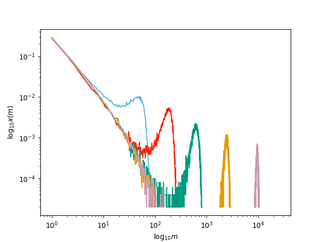
plt.figure(1)
plt.ylabel(r'$\log_{10} x(m)$')
plt.xlabel(r'$\log_{10} m$')
plt.savefig('fig6p1a.png')
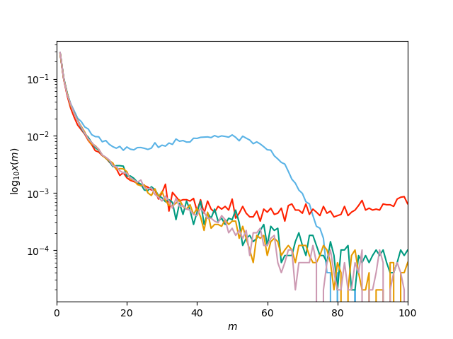
plt.figure(2)
plt.xlabel('$m$')
plt.ylabel('$\log_{10} x(m)$')
plt.axis(xmin = 0, xmax = 100)
plt.savefig('fig6p1b.png')
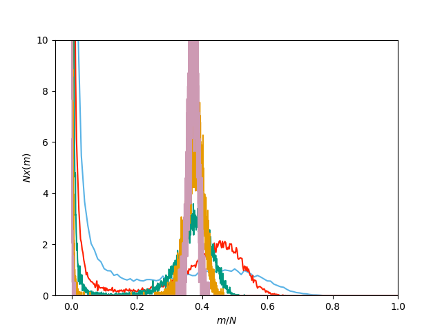
plt.figure(3)
plt.xlabel('$m/N$')
plt.ylabel('$Nx(m)$')
plt.axis(ymax=10, xmax=1, ymin=0)
plt.savefig('fig6p1c.png')